Embodied Purpose Sculpture
Finished a sculpture!
 More photos of the finished piece are on my main website.
About the Algorithm
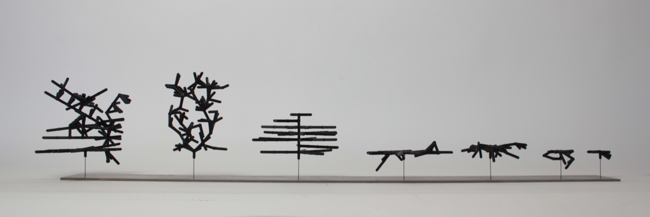
These are hand selected phenotypes from a final population of 80 individuals, after 40 generations of an evolution. The 80 individuals form a pareto-frontier for two objectives. The objectives are for 1) maximum number of nodes and 2) maximum average node ‘satisfaction’ at the end of 20 time-steps. Satisfaction or ‘fullness’ decreases 2 points everytime step and increases 5 points everytime a node eats. This may very well be an indication of the author’s own relationship with food.
The environment consisted of 60 nutrient spheres, in a 5 unit x 5 unit box. The box changed height as the structure grew. The spheres moved in a random walk, biased downwards very slightly.
Issues with Taking the Average
There are some issues with taking the average node-satisfaction score. One is rather ideological: taking the average satisfaction allows structures to be rewarded that have many under-nourished nodes, and a few highly nourished ones. To me this seems like an unfair way of assessing the health of a colony. I do not want to live in a society that asseses its health only by the average! That sounds like trickle-down economics. Blech. Of course in the context of an organism where each agent of the collective shares identical genetic information, as is the case in the instance, the averaging may have a different meaning. I think the following analogy might help.
Suppose each node in the colony can create ‘spores’ that will spawn the next colony. At the end of the life of the colony (in this case 20 time steps, arbitrarily) the satisfaction of the node determines how many spores it can make. The more spores created, the more likely a new colony forms. This would support selecting colonies by the sum of the satisfaction.
What is the average? Well it captures the ‘typical’ satisfaction score of the colony. Suppose, for some reason, only one node produces spores. Which node is determined by random chance. If the average satisfaction is high, it is more likely that the chosen node will produce many spores, and therefore have a high likelyhood of spawning a new colony. That seems to be the situation expressed in the above sculptures. Seems a bit convoluted to me. Are there any organisms that have such an arbitrary way of reproducing? If there were such organisms, they would be quickly clobbered by others that reproduce more effectively.
Besides the analogy sounding rather absurd, there is another issue, also related to the ideological one. The average says nothing about the spread of the satisfaction scores. This means that fit colonies might actually be quite ‘unfair’ or unequitable. Eep! Next time it might make sense to add another objective: low standard deviation of the satisfaction scores.
Here are some photos of the making:
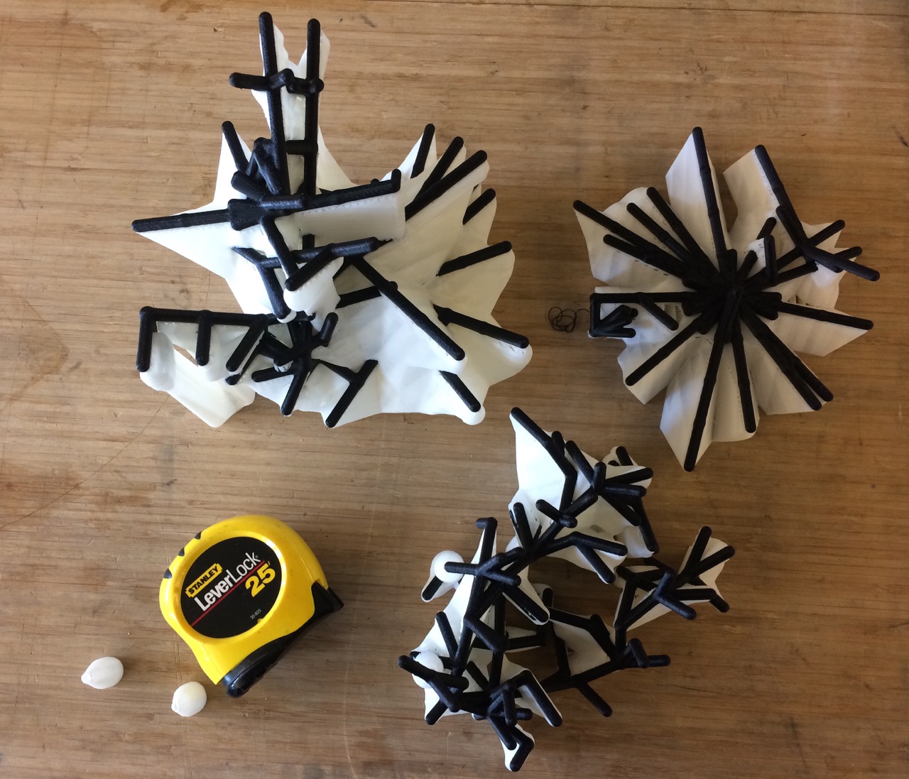 (Above) A few of the larger shapes just after 3d printing completed. These were printed on a Fortus450mc, thanks to pier9, where I am an instructor. The white material is dissolvable support. I chose to print using the Fortus for a few reasons. 1) The model-material is a tough plastic that is unlikely to crack. 2) The dissolvable support meant that I could print the rather complex shapes generated by colony-evolver without laboriously removing support.
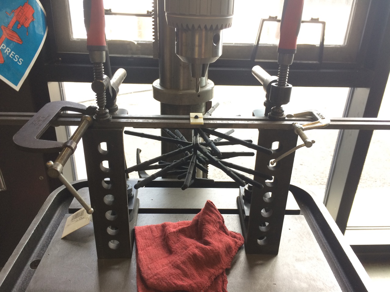 Drilling a hole in one of the larger ‘colonies.’ There are two small, 3d-printed blocks that match the diameter of the sculpture. This served the purpose of ensuring the drilled hole is closely aligned with the axis of the print.
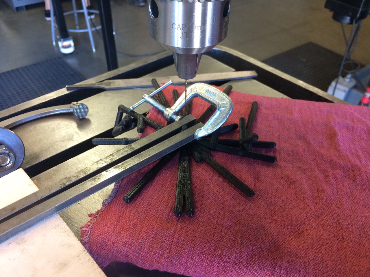 Here I was forced to abandon the 3d printed blocks because of the geometry of the print.
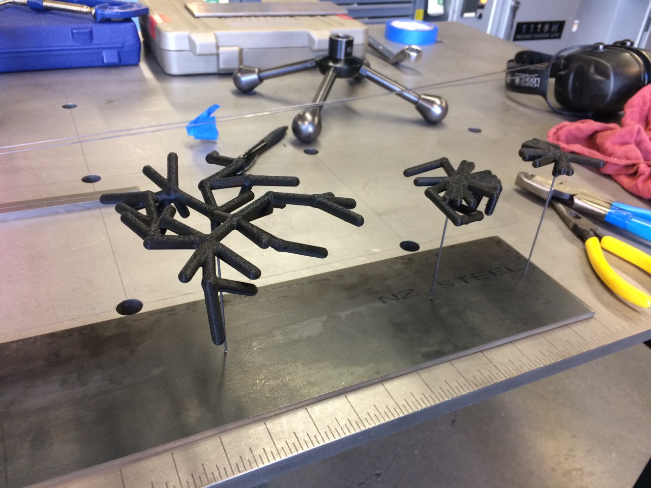 Each metal wire is held in by a shallow pocket on the underside of the metal base. The wire is bent into an ‘L’ shape and inserted up through the bottom. The foot of the ‘L’ fits in the pocket, and is bent slightly so that it presses against the walls of the pocket. This makes it easy to disassemble the sculpture.
Things Learned while Racing to Make a Sculpture
I was prancing along, playing with the multi-objective algorithms, wondering about polymorphism and jellyfish (see prev. post), when I realized that the Lumen Prize was due June1, which seemed like a good fit for the project. I hardly knew how the project would take form. I had three weeks and it seemed like a good fire to light under my own ass.
I ran a long evolution of 100 generations, hoping I would get some neat shapes that ‘embodied purpose,’ sort of the way a plant embodies the purpose of replicating its genes. I got this plot:
Dark blue to yellow is oldest to newest generations. Magenta is the all-time-best. The evolution was not evolving! Might as well have used a purely random search and saved the best finds. The whole draw of the evolutionary algorithm is to find incrementally better solutions to a problem. That wasn’t happening, and it felt silly to make a sculpture pretending it was.
After days of tweaking everything I could imagine, I discovered two major mistakes.
1- I was using the wrong pareto-frontier selection algorithm!
Two were supplied by DEAP: NSGA2 and SPEA2. All I knew was that both are supposed to select n non-dominated individuals from a population. Turns out NSGA2 doesn’t always work. Switched to SPEA2, populations got steadily better.
2- I was testing the fitness of a genome using a random environment.
The spherical nutrients moved randomly, and although the amount of randomness between tests was the same, the specific motion of the particles was not identical. It is as if the ‘weather’ was different each time I tested an individual. This meant that a slightly more fit individual in one generation might be less fit in the next generation. Since the algorithm operates by selecting the most fit individuals, even if they are only slightly more fit, and searching for improvements on those individuals, it can get stuck never improving. To fix this I simply ran one test per indvidual and fixed the random seed, which is like taking the weather of one day and fixing it so it happens the same way everytime.
The second issue I spent tons of time fiddling with, and realized that for these evolutionary algorithms to work (in the sense that they find better solutions than what they started with), there is an essential criteria. The variation between fitness of one genome, if it is being tested multiple times, must be small compared to the variation between fitness of different genomes. If the fitness evaluation is deterministic and only happens once, this is a non-issue.
Here is a plot using SPEA2 and one fixed-seed fitness test per genome:
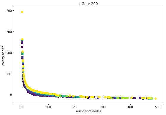
The generations are always slightly better than the previous. Sure they get hung up, and it seems like the rate of improvement slows down, but the main point is that they each generation is never worse. The problem of getting stuck is a weakness of objective-based evolutionary algorithms. That’s why I have plans for trying some techniques like novely search.
I find it telling that only after I grapled with the second issue did I sort out the first, more underlying problem. Dear self: inspect the basic assumptions and simplest factors first! Anyway, it may be interesting to re-run the algorithm with non-deterministic fitness tests and see if the evolution can make progress. It is likely any progress would be slower, with more backward steps.
Summary
- Use SPEA2 not NSGA2
- Make sure variation between multiple tests of one genome is small compared to variation between different genomes.
Polymorphism
I want to expand on last post, because I think the last section touched on an interesting phenomena. It is summared by these two plots:
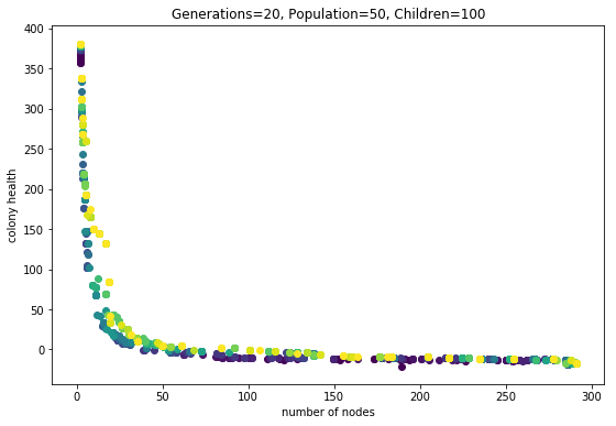
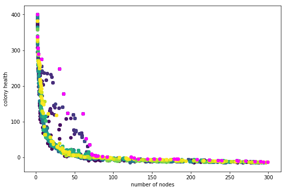
Fig1. This evolution run had three phenotype evaluations.
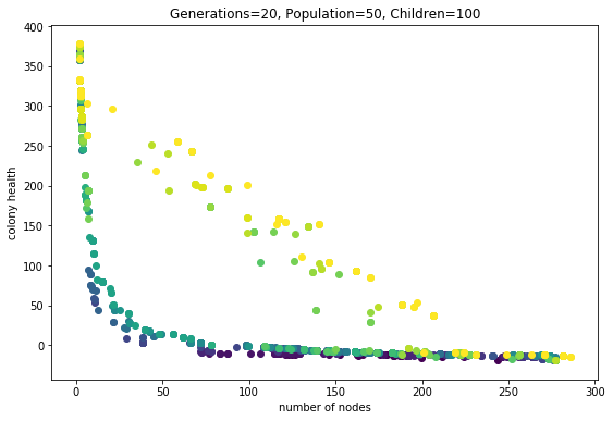
Fig2. This evolution run had seven phenotype evaluations. All else was equal.
What do I mean by “seven phenotype evaulations”? Each genotype (individual) is used to grow some number of phenotypes. Each phenotype is evaluated for fitness (in this case number-of-nodes and health). Then all the fitness scores are averaged, respectively.
What is the meaning of this multiple-phenotype expression? It’s as if multiple clones are being budded off of a single genome. It is making these ‘organisms’ behave as though they reproduce asexually and sexually. The sexual reproduction happens when child genomes are created during each round of the evolutionary algorithm. The asexuall reproduction is happening everytime the evaluation function operates, where it does multiple phenotype evaluations.
So what is the effect? One is that the pareto frontier can explode outwards, to higher average fitness. This is clearly seen in the last couple of generations in the second plot. Why are these individuals so much more fit? I think it is because they are exhibiting “polymorphism”. Poly means “many” and morphe means “form,” so in this context this is saying that a single genotype can exhibit many phenotypic forms. Since the fitness scores from these different forms are averaged, the genotype can more effectively find a niche on the pareto-frontier than a monomorphic genotype.
This is clearly seen in the follwing images. These depict one phenotype for each genome in the pareto-frontier of the final generation (the 20th). The average number of nodes and health is printed. Note this is not the same as the specific fitness for the phenotype you are looking at.
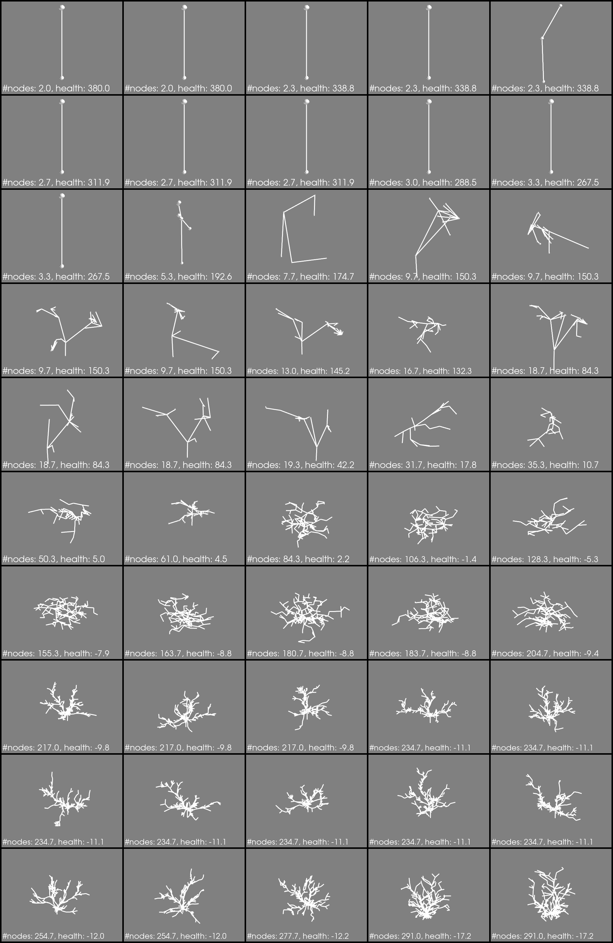
Fig3. Phenotype evaulations = 3
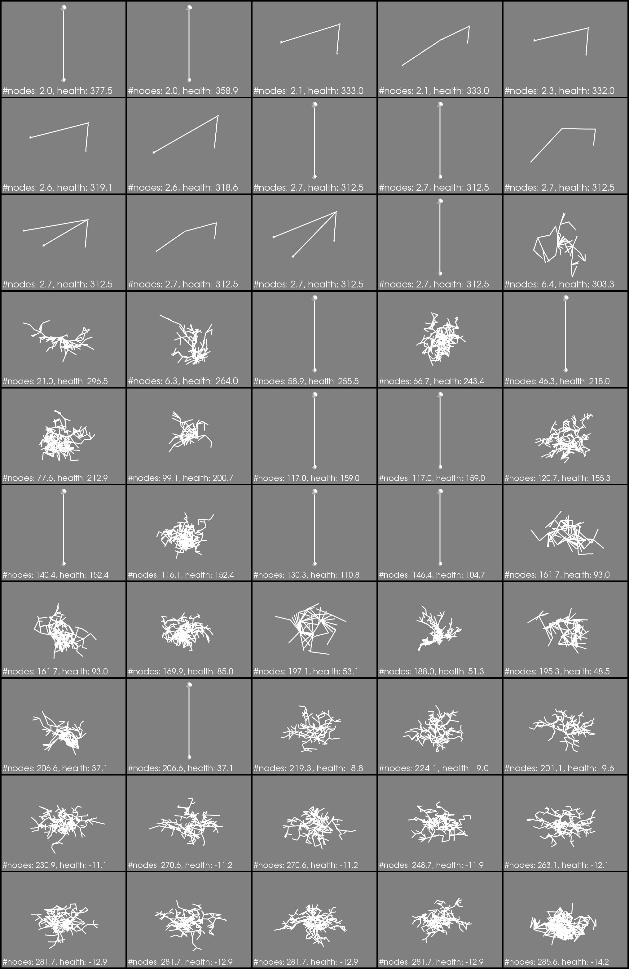
Fig4. Phenotype evaulations = 7
Notice how a bunch of boring little Q-tips are in the center of Fig4.? These correspond to the yellow dots that are way out in Fig2. If I generate a colony (phenotype) from these genomes multiple times, some times they make a bushy-shape, sometimes a q-tip. Polymorphism!
How this works I don’t know. I would need to dissect the processor trees (the genomes) of the polymorphic individuals. I would expect to see some probablistic switch that results in some precentage of phenotypes being q-tips, and some other percentage being bushy. That investigation is for another day.
I think these results are suggesting that organisms that reproduce both sexually and asexually are more likely to exhibit polymorphism. But there are a number of conditions imposed here that may be critical to that hypothesis: 1) selection operates similar to pareto-frontier selection, 2) consistent cycles of asexuall and sexuall reproduction occur.
Anecdotal evidence: The phylum Cnidaria is noted on wikipedia as being charachterized by polymorphism; many animals in this category have a polyp form and a medusa form. Cnidarians reproduce asexually as well as sexually. Things are more complicated because it seems that in some variants polyps do not sexually reproduce. Really this idea needs to be checked with biologists. I wouldn’t be surprised if this is old news to biologists, but its pretty exciting for me!
Population Needs to be Big for Pareto-Front to Move
While the last two posts were exciting because a multi-objective evolution ran and spat out some neat shapes, I had to check if the evolution was actually finding better populations.
import ColonyEvolver.evolve_colony_multi_obj as ev
reload(ev)
<module 'ColonyEvolver.evolve_colony_multi_obj' from '/Users/josh/Projects/ColonyEvolver_above/ColonyEvolver/evolve_colony_multi_obj.py'>
info, archive = ev.main()
gen	nevals	avg                          	std                          	min                        	max
0  	25    	[ 179.69142857  100.03209854]	[ 158.46217436  167.08081721]	[  2.         -19.99791905]	[ 439.57142857  355.        ]
1  	48    	[ 227.76571429   16.73458574]	[ 143.79577287  101.42524822]	[  2.         -16.86966543]	[ 447.          364.64285714]
2  	46    	[ 233.31428571   17.55206654]	[ 138.30070167  102.03801106]	[  2.         -16.86966543]	[ 447.          364.64285714]
3  	45    	[ 235.76571429   20.21989035]	[ 153.93481727  102.09670425]	[  2.         -16.06184076]	[ 447.          364.64285714]
4  	39    	[ 175.50285714   38.46083977]	[ 145.44557363  120.98575388]	[  2.         -16.71785968]	[ 448.57142857  364.64285714]
5  	46    	[ 173.79428571   37.89007022]	[ 137.98761897  121.15668099]	[  2.         -16.71785968]	[ 448.57142857  364.64285714]
6  	41    	[ 190.66285714   39.57204475]	[ 147.25656566  121.45121315]	[  2.         -16.71785968]	[ 448.57142857  364.64285714]
7  	46    	[ 148.56         61.71167985]	[ 152.06825492  134.6276333 ]	[  2.         -16.71785968]	[ 448.57142857  364.64285714]
8  	45    	[ 143.56571429   87.54939393]	[ 154.78536808  156.97171347]	[  2.         -16.71785968]	[ 448.57142857  364.64285714]
9  	47    	[ 173.69714286   21.5299556 ]	[ 157.46930933   77.42182592]	[  2.         -16.71785968]	[ 448.57142857  367.85714286]
10 	46    	[ 160.92571429   27.50332923]	[ 159.32660395   79.07821019]	[  2.         -16.71785968]	[ 448.57142857  367.85714286]
import matplotlib.pyplot as plt
import matplotlib.cm as cm
import numpy as np
v = np.linspace(0, 1, len(archive))
colors = cm.viridis( v )
fig = plt.figure(figsize=(9,6))
for i,generation in enumerate(archive):
    g = np.array(generation)
    n = g[:,0]
    h = g[:,1]
    plt.scatter(n, h, c=colors[i])
plt.xlabel('number of nodes')
plt.ylabel('colony health')
plt.show(fig)
This plot was generated with Population=25 and Children=50. Code is at git tag list-save
In this plot darker points are individuals from earlier generations. This does not look so great. What I am hoping to see is each generation slightly offset from the previous one, in the direction of the upper right hand corner. It looks like there is a little movement in that direction, especially in the ~60 number-of-node region. But something is not right.
What is going on? Here are some ideas.
- There is not enough variation to select slightly better individuals.
- The random nature of simulation runs is confusing the results. This means that individuals that are slightly better are not being selected consistently because on some evaluations they get a low score. I am using 7 simulation runs per individual for this run. That number is rather arbitrary; it really depends on the variation between runs for a given individual. The scary thing is that this variation probably depends on the individual. Some individuals, as a result of their genome, are probably going to result in a wider range of phenotypes. Uh-oh!
- The variation is there but the wrong individuals are being selected.
- Everything is fine, just need to run a longer evolution.
1, 2, and 4 seem likely. If 2 is true its not so terrible; in the long run individuals that result in inconsistent fitness may die-out. 1 maybe means I should do a run with a larger population. Comparing to the knapsack example shows that I halved the population size (just to make it run faster). I think its time to try out a bigger run.
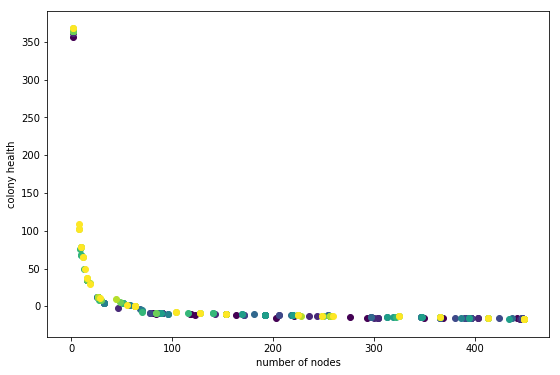
Ok did that. Here is the output:
Code is at git tag mult-obj-more-gen
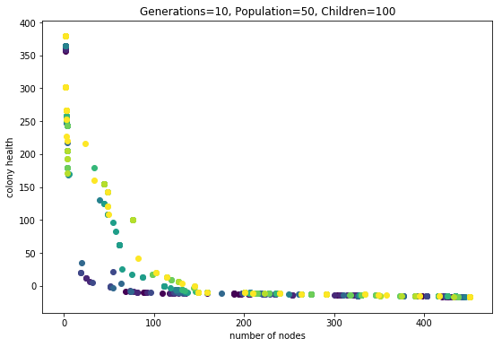
Wow this looks alot better.
Learning from these Results
The Effect of Averages
Check out these two phenotypes from the same genotype (health rank = 21):
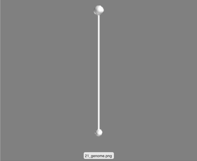
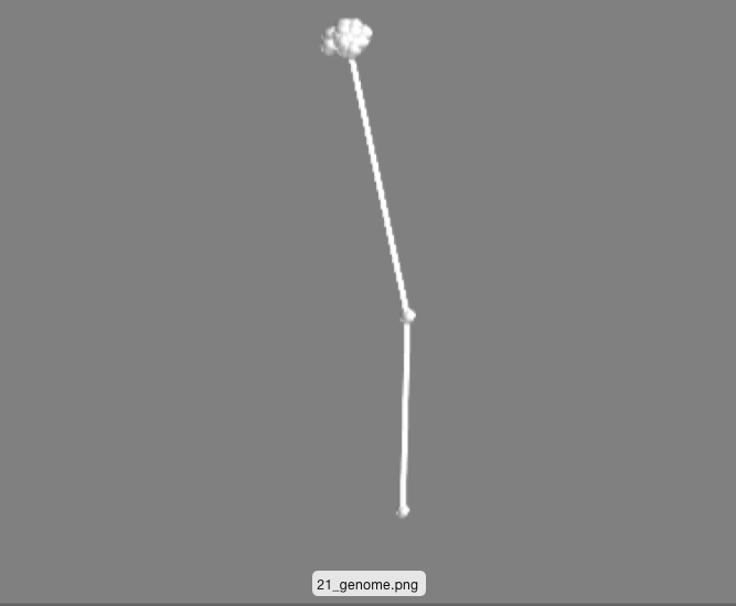 These are simply two different runs of the same genome (processor tree deciding what to do when a node gets ‘fed’).
One is just the initital ‘seed’ that every phenotype starts with: two nodes vertically oriented. The other has an off-shoot and a little bundle of nodes. I think this is a happening becuase of the following. For each genotype 7 phenotypes are generated and evaluated for fitness. The 7 scores are averaged. This means that a genotype that produces a wide range of phenotypes might actaully do quite well. Perhaps some percentage of the time the depicted genotype makes no modification to the seed, racking up a high health score. Other times the genotype makes the bundle of nodes and gets a better ‘number-of-nodes’ score. Taking the average, this genotype results in something in-between, allowing it to make it to further rounds by occupying a unique niche on the pareto-frontier.
This averaging idea might explain why there are so many phenotypes that look the same (see image below). Perhaps the difference between these is that they have a different likelyhood of making a taller phenotype everynow and then.
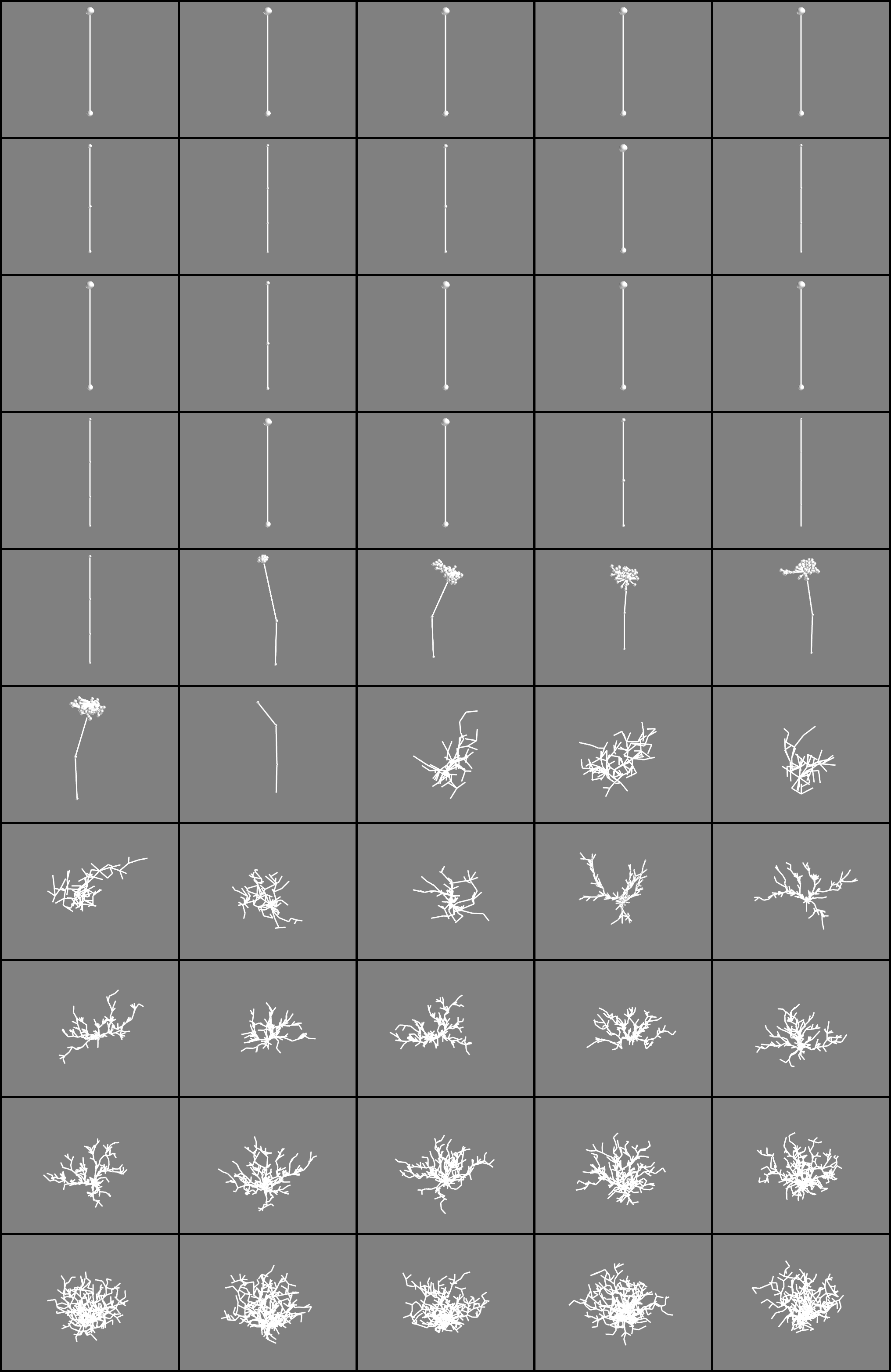 Phenotypes sorted by health from the final pareto-frontier (yellow dots in the plot). Descending health from upper left to the right.
Finally here are some awesome phenotypes (note that the reported #nodes and health is for this one phenotype, not the average obtained in the fitness evaluation)
![]()
![]()
![]()
Shapes from the first multi-objective run
 These shapes are colonies from the final pareto frontier of a multi-fitness crieteria evolutionary algorithm. See the previous post for explanation.
The images are ordered from top left accross according to colony health. They correspond to the dots in this plot:
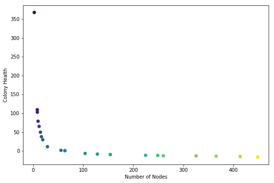
So the lightest dot corresponds to lower right corner.
Health is the average node health, over all the nodes in a colony, at the end of the simulation run. Five health points are given to each node when it ‘eats’ (gets collided by a particle). One health point is subtracted for each time-step. Admittedly taking the average may be making the health score suscpetable to outliers. Next time consider trying sum of all health scores.
Anyway, it makes sense that the highest health genome is one that results in no growth added to the seed (the two-node stick). These two nodes get bombarded by particles during the entire simulation. On the other end of the spectrum are colonies that are giant and tangly. Not surprisingly these colonies have low average health; all but the topmost nodes are starved for nutrients.