Shapes from the first multi-objective run
 These shapes are colonies from the final pareto frontier of a multi-fitness crieteria evolutionary algorithm. See the previous post for explanation.
The images are ordered from top left accross according to colony health. They correspond to the dots in this plot:
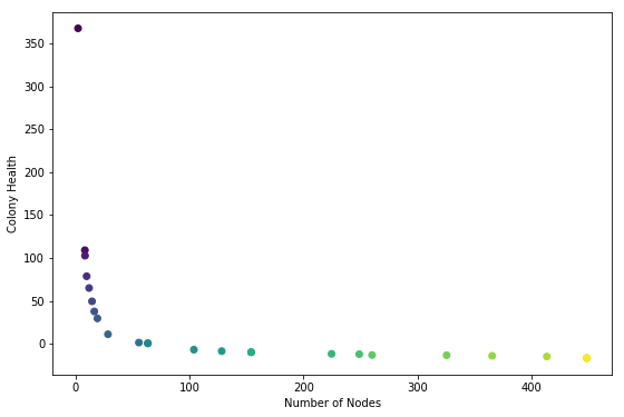
So the lightest dot corresponds to lower right corner.
Health is the average node health, over all the nodes in a colony, at the end of the simulation run. Five health points are given to each node when it ‘eats’ (gets collided by a particle). One health point is subtracted for each time-step. Admittedly taking the average may be making the health score suscpetable to outliers. Next time consider trying sum of all health scores.
Anyway, it makes sense that the highest health genome is one that results in no growth added to the seed (the two-node stick). These two nodes get bombarded by particles during the entire simulation. On the other end of the spectrum are colonies that are giant and tangly. Not surprisingly these colonies have low average health; all but the topmost nodes are starved for nutrients.
Back to All Posts