Population Needs to be Big for Pareto-Front to Move
While the last two posts were exciting because a multi-objective evolution ran and spat out some neat shapes, I had to check if the evolution was actually finding better populations.
import ColonyEvolver.evolve_colony_multi_obj as ev
reload(ev)
<module 'ColonyEvolver.evolve_colony_multi_obj' from '/Users/josh/Projects/ColonyEvolver_above/ColonyEvolver/evolve_colony_multi_obj.py'>
info, archive = ev.main()
gen	nevals	avg                          	std                          	min                        	max
0  	25    	[ 179.69142857  100.03209854]	[ 158.46217436  167.08081721]	[  2.         -19.99791905]	[ 439.57142857  355.        ]
1  	48    	[ 227.76571429   16.73458574]	[ 143.79577287  101.42524822]	[  2.         -16.86966543]	[ 447.          364.64285714]
2  	46    	[ 233.31428571   17.55206654]	[ 138.30070167  102.03801106]	[  2.         -16.86966543]	[ 447.          364.64285714]
3  	45    	[ 235.76571429   20.21989035]	[ 153.93481727  102.09670425]	[  2.         -16.06184076]	[ 447.          364.64285714]
4  	39    	[ 175.50285714   38.46083977]	[ 145.44557363  120.98575388]	[  2.         -16.71785968]	[ 448.57142857  364.64285714]
5  	46    	[ 173.79428571   37.89007022]	[ 137.98761897  121.15668099]	[  2.         -16.71785968]	[ 448.57142857  364.64285714]
6  	41    	[ 190.66285714   39.57204475]	[ 147.25656566  121.45121315]	[  2.         -16.71785968]	[ 448.57142857  364.64285714]
7  	46    	[ 148.56         61.71167985]	[ 152.06825492  134.6276333 ]	[  2.         -16.71785968]	[ 448.57142857  364.64285714]
8  	45    	[ 143.56571429   87.54939393]	[ 154.78536808  156.97171347]	[  2.         -16.71785968]	[ 448.57142857  364.64285714]
9  	47    	[ 173.69714286   21.5299556 ]	[ 157.46930933   77.42182592]	[  2.         -16.71785968]	[ 448.57142857  367.85714286]
10 	46    	[ 160.92571429   27.50332923]	[ 159.32660395   79.07821019]	[  2.         -16.71785968]	[ 448.57142857  367.85714286]
import matplotlib.pyplot as plt
import matplotlib.cm as cm
import numpy as np
v = np.linspace(0, 1, len(archive))
colors = cm.viridis( v )
fig = plt.figure(figsize=(9,6))
for i,generation in enumerate(archive):
    g = np.array(generation)
    n = g[:,0]
    h = g[:,1]
    plt.scatter(n, h, c=colors[i])
plt.xlabel('number of nodes')
plt.ylabel('colony health')
plt.show(fig)
This plot was generated with Population=25 and Children=50. Code is at git tag list-save
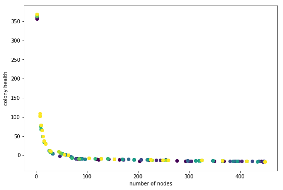
In this plot darker points are individuals from earlier generations. This does not look so great. What I am hoping to see is each generation slightly offset from the previous one, in the direction of the upper right hand corner. It looks like there is a little movement in that direction, especially in the ~60 number-of-node region. But something is not right.
What is going on? Here are some ideas.
- There is not enough variation to select slightly better individuals.
- The random nature of simulation runs is confusing the results. This means that individuals that are slightly better are not being selected consistently because on some evaluations they get a low score. I am using 7 simulation runs per individual for this run. That number is rather arbitrary; it really depends on the variation between runs for a given individual. The scary thing is that this variation probably depends on the individual. Some individuals, as a result of their genome, are probably going to result in a wider range of phenotypes. Uh-oh!
- The variation is there but the wrong individuals are being selected.
- Everything is fine, just need to run a longer evolution.
1, 2, and 4 seem likely. If 2 is true its not so terrible; in the long run individuals that result in inconsistent fitness may die-out. 1 maybe means I should do a run with a larger population. Comparing to the knapsack example shows that I halved the population size (just to make it run faster). I think its time to try out a bigger run.
Ok did that. Here is the output:
Code is at git tag mult-obj-more-gen
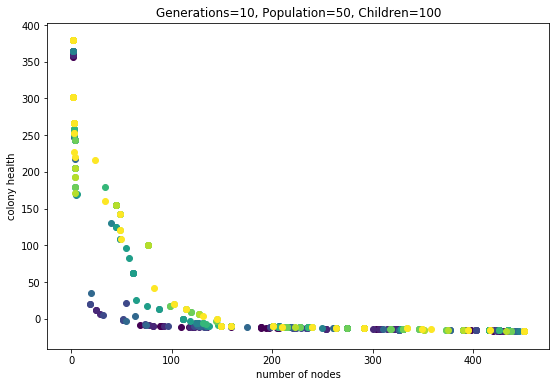
Wow this looks alot better.
Learning from these Results
The Effect of Averages
Check out these two phenotypes from the same genotype (health rank = 21):
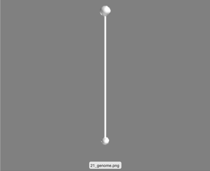
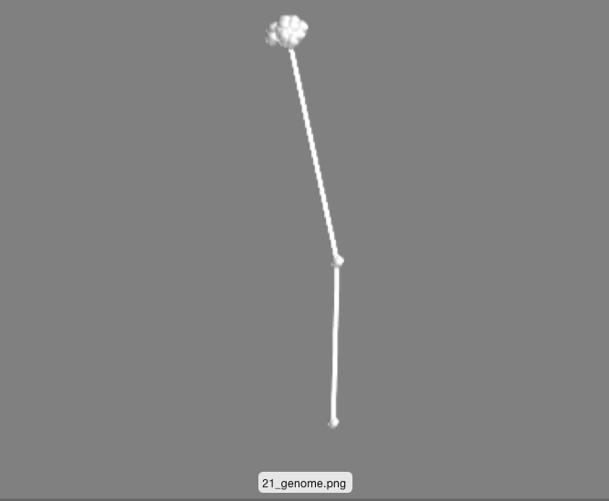 These are simply two different runs of the same genome (processor tree deciding what to do when a node gets ‘fed’).
One is just the initital ‘seed’ that every phenotype starts with: two nodes vertically oriented. The other has an off-shoot and a little bundle of nodes. I think this is a happening becuase of the following. For each genotype 7 phenotypes are generated and evaluated for fitness. The 7 scores are averaged. This means that a genotype that produces a wide range of phenotypes might actaully do quite well. Perhaps some percentage of the time the depicted genotype makes no modification to the seed, racking up a high health score. Other times the genotype makes the bundle of nodes and gets a better ‘number-of-nodes’ score. Taking the average, this genotype results in something in-between, allowing it to make it to further rounds by occupying a unique niche on the pareto-frontier.
This averaging idea might explain why there are so many phenotypes that look the same (see image below). Perhaps the difference between these is that they have a different likelyhood of making a taller phenotype everynow and then.
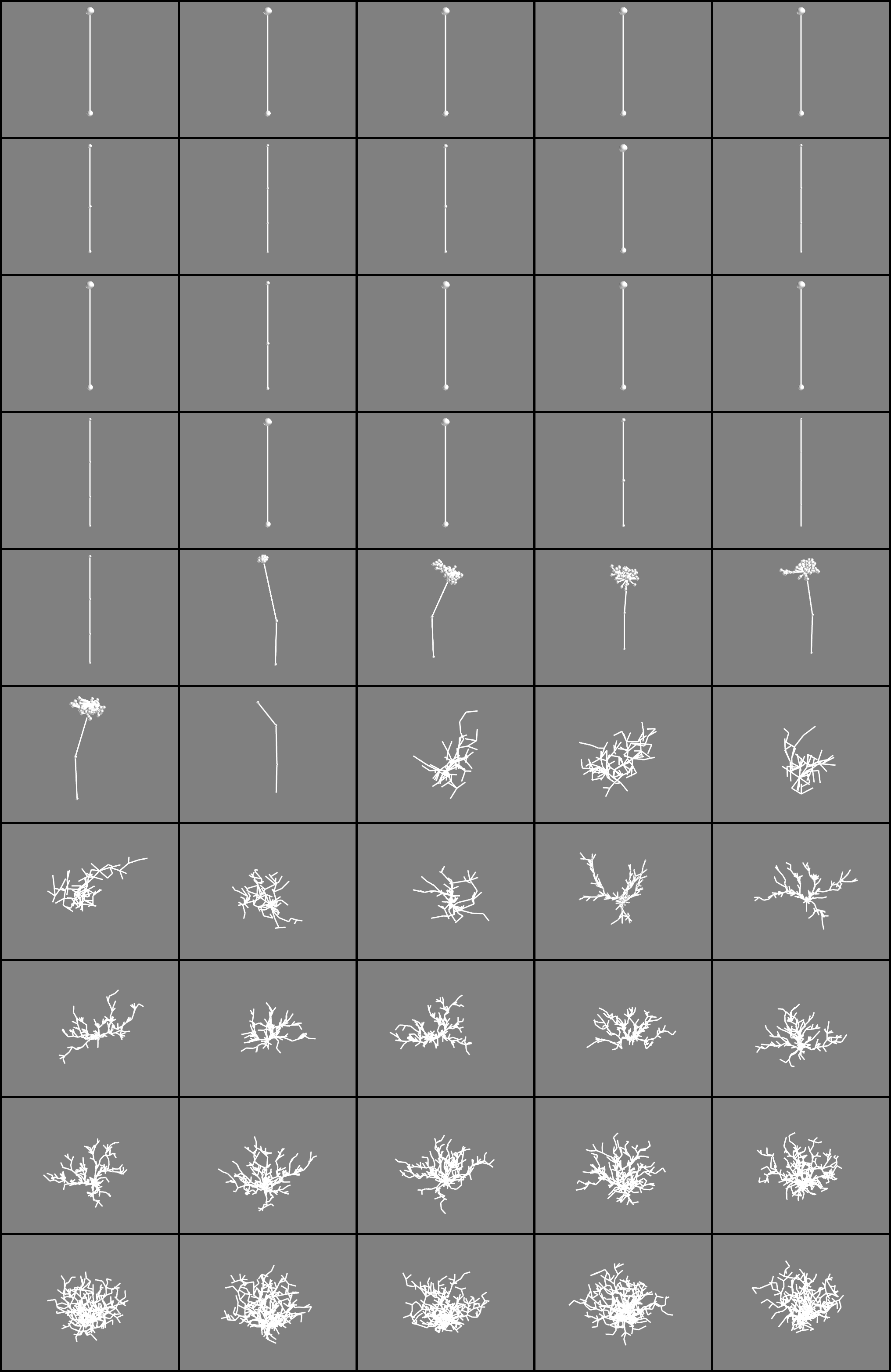 Phenotypes sorted by health from the final pareto-frontier (yellow dots in the plot). Descending health from upper left to the right.
Finally here are some awesome phenotypes (note that the reported #nodes and health is for this one phenotype, not the average obtained in the fitness evaluation)
![]()
![]()
![]()