Multi Objective Evolution
Today I spent some time understanding the knapsack example, provided by the deap documentation. This is a great example for me because it uses multi-objective optimization, which is critical for my current curiosity. More on that in a future post.
My goal was to make sure that my understanding of multi-objective optimization corresponds with what is actually possible with DEAP. Since I like visuals, I decided to make a plot of what the evolution is doing. Here it is:
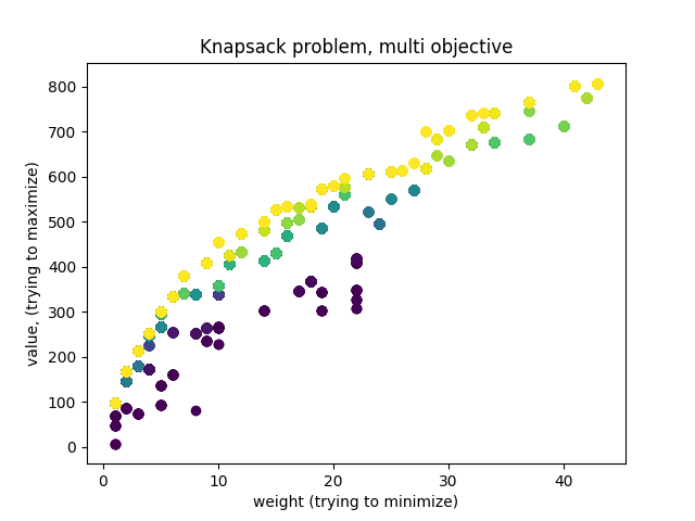
Oooh pretty colors. This plot was made using matplotlib. The color map is matplotlib.cm.viridis.
Each color represents a generation in the evolution. Brighter colors are newer generations. Each dot is an individual solution to the knapsack problem. The knapsack problem is like the problem faced by a backpacker who is trying to decide what items to put in her ‘knapsack’. There are a bunch of items with some weight and value. The goal is to have a ‘knapsack’ that is below some critical weight, and has high value. So the optimization problem has multiple objectives: low-weight and high value.
The easy way to adapt this to a normal evolutionary algorithm is to perform a weighted sum of the two objectives. The problem is that by scaling the two metrics and suming, a bias is injected into the search. Only solutions that perform well for a particular level of relative importance between the objectives will be found. This is quite limiting when you are interested in seeing a wide range of good solutions. Other problems exist with the weighted sum approach: How does one scale objectives that have unkown bounds? How does one scale objectives that have radically different meanings or units?
Luckily there is an elegant way to completely avoid cobbling disimilar metrics together. The essential idea is the pareto frontier. Basically this is the set of all individuals that are the best in their own special way at some combination of objectives (this property is called ‘non-dominated’). All the evolution has to do is select individuals from the pareto frontier, and after many generations the frontier gets better and better. See the wikipedia on multi-objective optimization.
So if we plot the weight and value for each individual, and color them by generation, we should see the dots forming a sort of buldge that moves further from the previous colors. This is indeed what we see. I was a little confused at first that the bulge moved to the upper right. This is reconciled by the fact that the algorithm is selecting for low weight.
Also, wow matplotlib’s new default plotting looks pretty good. Go open source!!
Back to All Posts